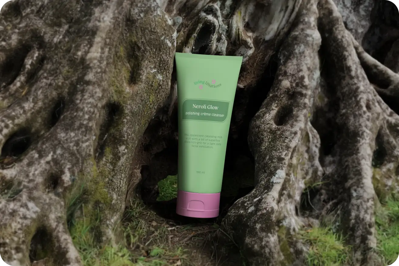
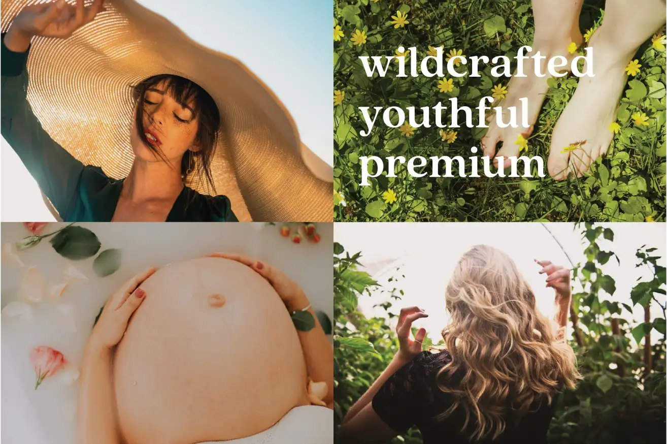
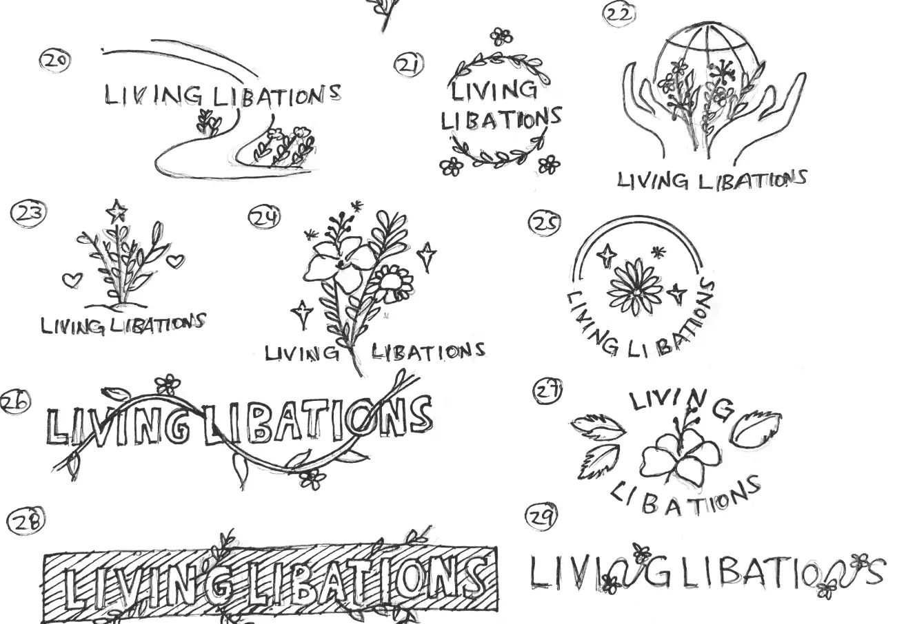
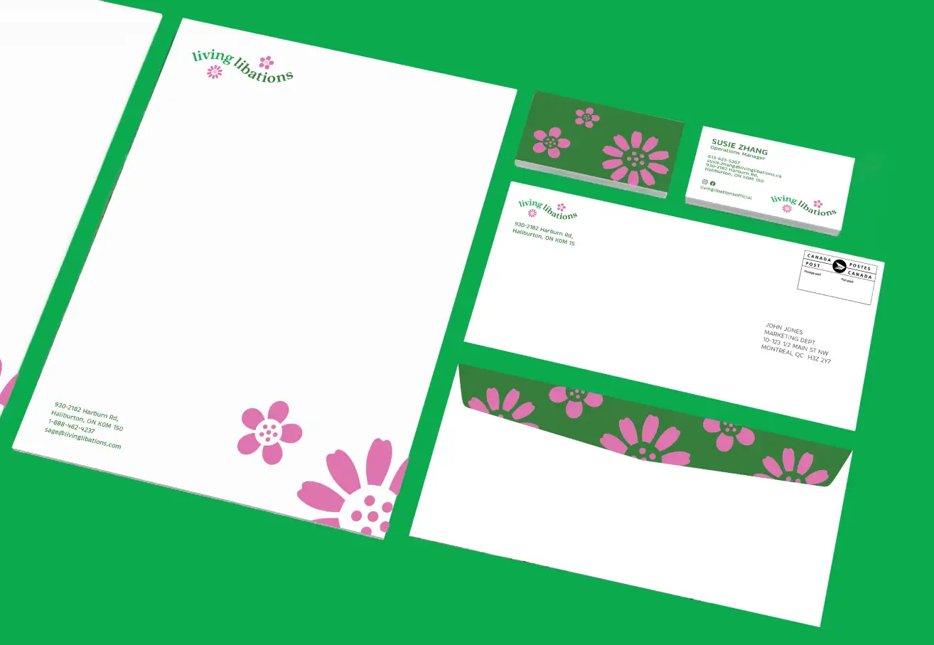
Logo, colour palette, photography style, visual tone, and typography


A full stationery package including business card, letterhead, and envelope; and a 20-page branding guide.

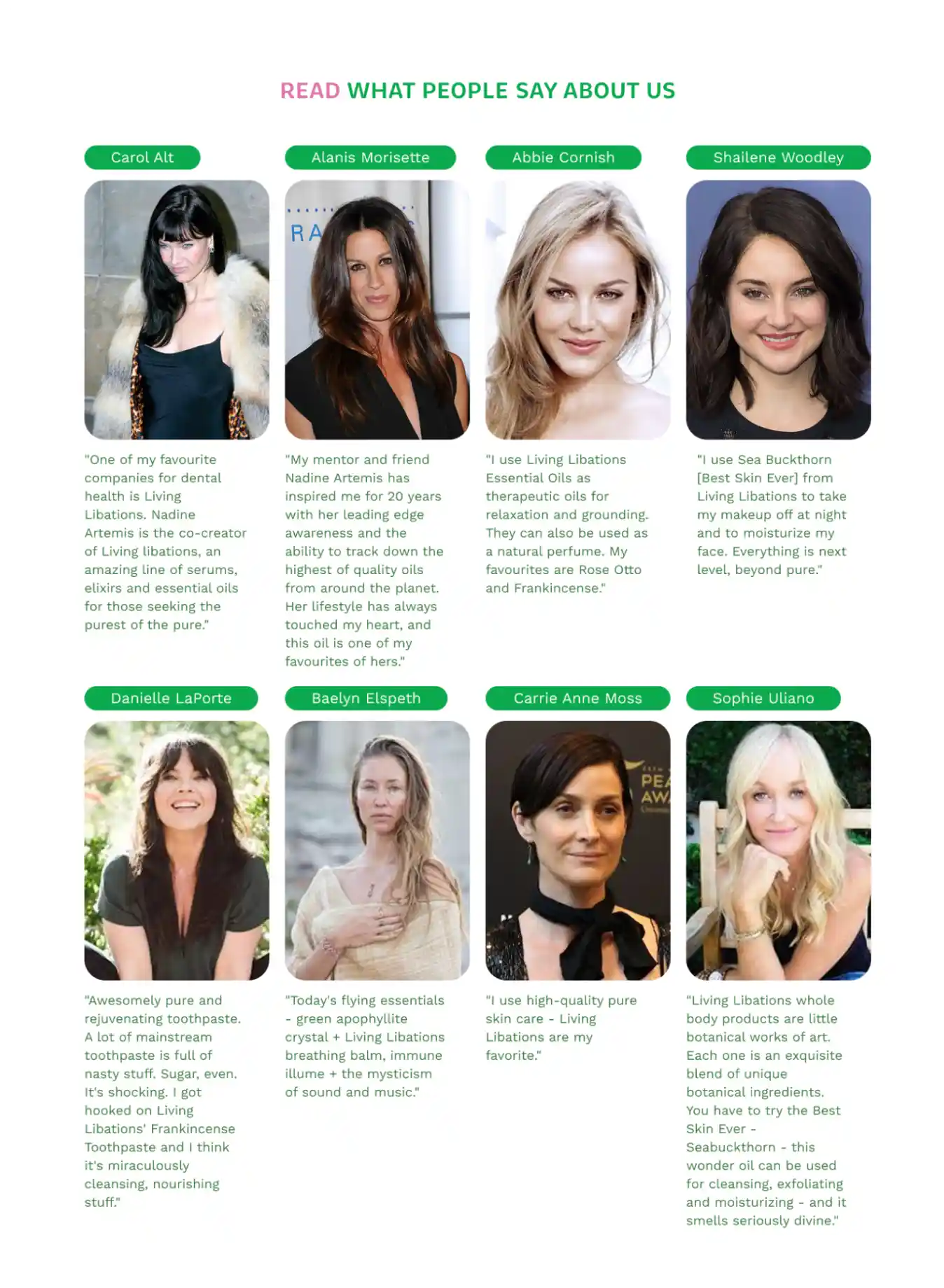
Three pages of the site were redesigned to reflect the new identity and to improve site flow and functionality. The new site combines the philosophy, creators, and headquarters content into one cohesive Brand Story. (The brand has updated its website since this redesign).

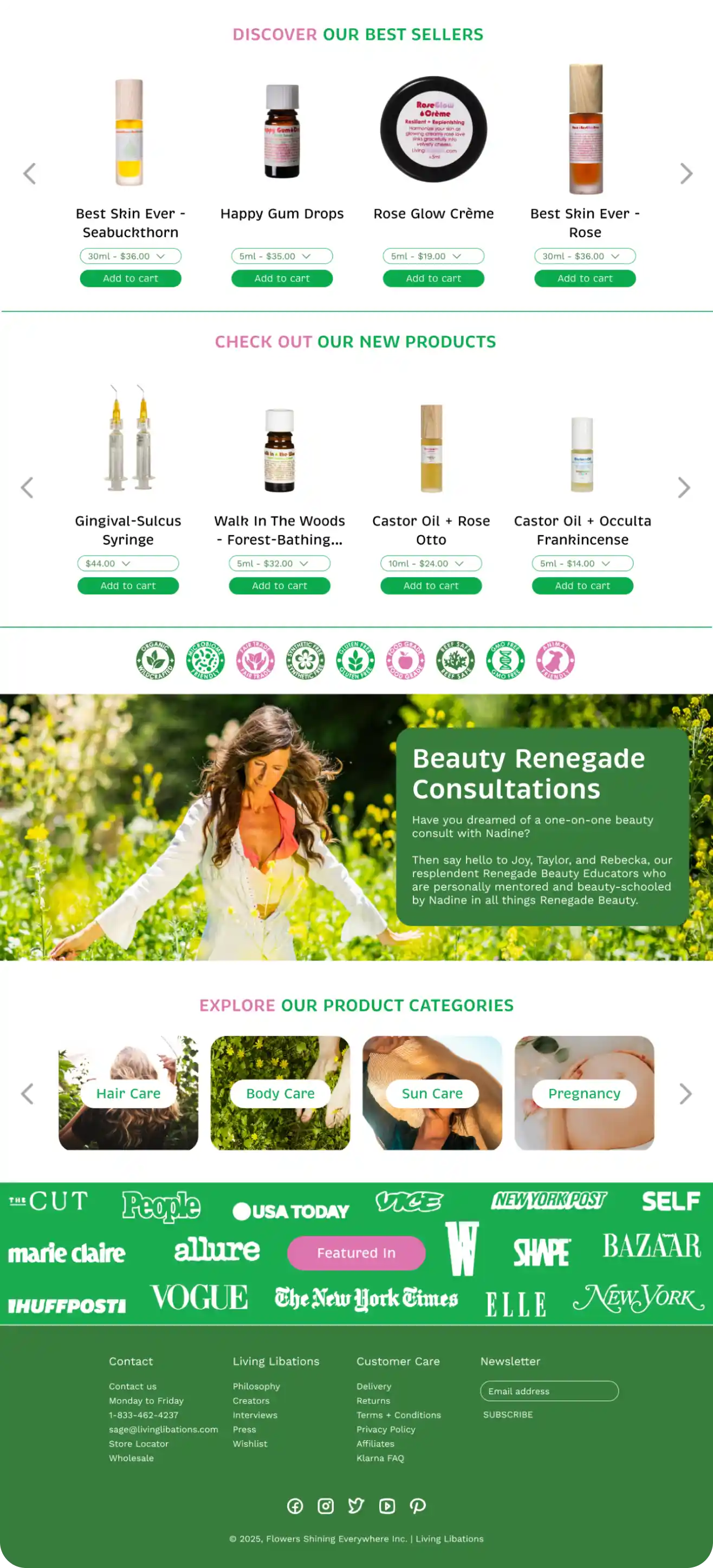
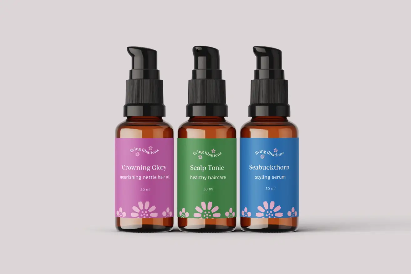
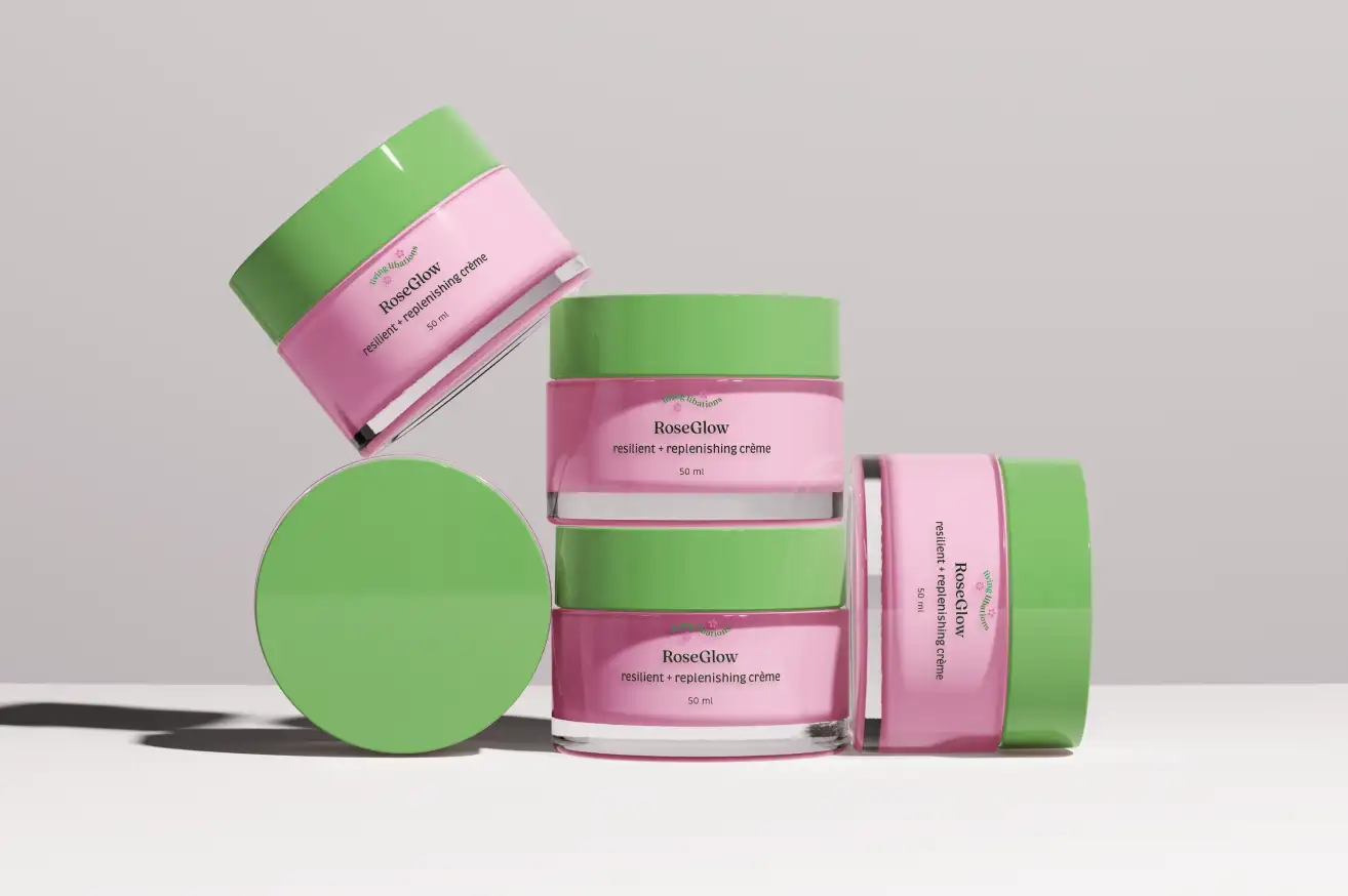
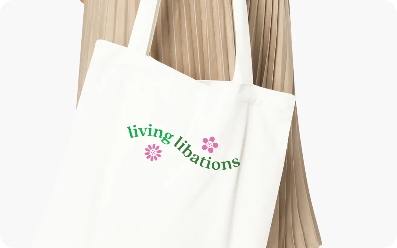
The rebranding is vibrant and harmonious and remains true to the brand ethos. The new identity differs from the prevailing clean minimalism found in the current natural beauty market, setting it apart from competitors.